Comprehensive Guide & Technical Breakdown
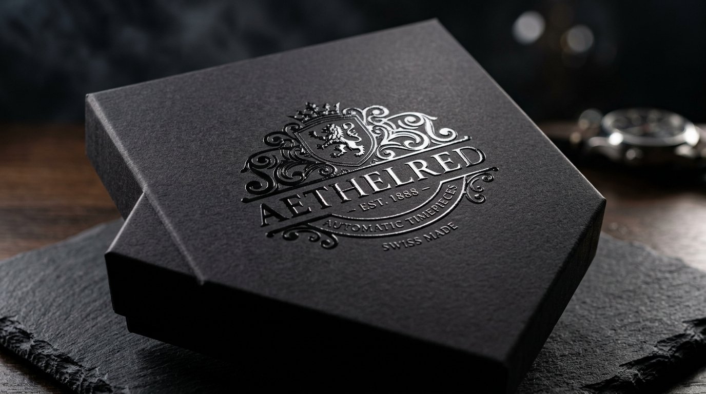
Selecting between Pantone (Spot Colors) and CMYK (Process Color) is a foundational decision in packaging print production:
### 1. CMYK Process Color (4 Inks: Cyan, Magenta, Yellow, Black)
- Mechanism: Tiny overlapping halftone dots blend visually to create thousands of colors.
- Strengths: Necessary for photographic images and multi-color illustrations.
- Limitation: Slight color shifts can occur between different print batches due to press temperature, ink viscosity, and paper absorbency.
- Mechanism: Inks are pre-mixed like paint to an exact recipe before going onto the press.
- Strengths: 100% exact color matching across different packaging suppliers, continents, and substrates. Essential for signature brand colors (like Tiffany Blue, Cadbury Purple, or Coca-Cola Red).
- Specialty Capabilities: Allows neon fluorescents, pastels, and genuine metallics that CMYK cannot reproduce.
### 2. Pantone Matching System (PMS / Spot Inks)
### Best Practice:
Use CMYK for product photography + 1 or 2 Pantone spot colors for logos and critical brand assets.